
There was a time when choosing a web stack meant choosing a side. Angular or React. Node.js or Java. Someone had a benchmark. Someone else explained why the benchmark was meaningless. A third person suggested rewriting everything in a language nobody on the team knew.
It was exhausting. It was ridiculous. It had a certain romance.
Now imagine asking an AI builder for a website. Before you’ve finished thinking about the audience, there’s a Next.js app, a handful of Tailwind classes, and a very confident hero section.
The architecture meeting has been replaced by an autocomplete. And the annoying part is: the result might be pretty good.
The default wasn’t an election
First, a small correction to the premise: there’s no universal law that neural networks prefer Next.js and Tailwind. An assistant inside an Angular repository has different context from a website generator starting an empty project. The model, its instructions, the starter, and the tools around it all matter.
Sometimes the explanation is refreshingly literal. v0’s documentation says new chats start with Next.js, shadcn/ui, and Tailwind CSS. In that case, the stack isn’t a spontaneous architectural insight. It’s already in the room.
The next layer reinforces it: the recommended Next.js setup includes Tailwind, alongside TypeScript and the App Router. Choosing one tool can quietly choose several others for you.
It’s tempting to explain the whole thing with “there must be loads of this in the training data.” That’s a plausible influence, but I don’t know the training mix of every model, and neither does a screenshot of generated code.
My simpler explanation: familiar conventions, compatible components, and ready-made starters reduce the number of decisions between a prompt and a working preview. The product’s defaults can explain a lot before we start psychoanalysing the model.

Tailwind keeps the styling close
Tailwind is particularly convenient for producing a chunk of UI in one go. Its utility classes put styling decisions directly in the markup: spacing, colours, layout, responsive behaviour. A component can carry much of its visual recipe with it.
<section className="grid gap-6 rounded-xl p-8 md:grid-cols-2">
  {/* Layout, spacing, and a breakpoint, all within reach. */}
</section>
For an assistant editing that component, this can mean less hunting through
stylesheets to find the rule behind a button. That’s an ergonomic advantage,
not proof that a model has better taste when it sees
rounded-xl.
Add shadcn/ui’s editable component source, and there’s more concrete code to work with. The assistant can adapt an existing component instead of inventing every interaction from a blank file. You still need to check what it changed, including keyboard behaviour and accessibility.

The good part is actually good
A sensible default gets you past a surprisingly expensive stage of a project: agreeing how to begin.
For a React-based product that needs several routes, interactive screens, and server-side features, Next.js can give the work a useful structure. Tailwind can make visual iteration quick. A shared component foundation can keep the first five screens from looking like five separate companies.
The benefit is especially clear when you’re testing an idea. A working screen lets someone say, “Actually, I wouldn’t use this,” while changing course is still cheap. That is much more useful than a beautifully argued stack decision attached to a product nobody has seen.
There’s also less ceremony around ordinary work. A settings page can just be a settings page. It doesn’t have to become a referendum on the future of frontend engineering.
I can appreciate that. Even if I would have enjoyed the referendum.

The invoice arrives later
The trouble starts when “easy to generate” becomes “right for this project” without anyone checking the gap between the two.
A three-page brochure and a collaborative dashboard are both “websites” in a prompt. They have very different needs. A scaffold that fits the dashboard may give the brochure a build process and dependency maintenance it didn’t need.
To be fair, Next.js supports static HTML exports. It doesn’t automatically mean running a server for a page of text. Still, the fact that a framework can do a small job doesn’t settle whether you want that framework in the project.
For an app that uses server features, you also inherit decisions about what runs where, how data reaches the browser, and how deployment works. Those decisions may be worth it. They don’t stop existing because an assistant generated the files.
Tailwind has its own small traps. Repeating nearly identical class strings can become a maintenance problem. And an assistant can generate a plausible-looking dynamic class that never produces CSS: Tailwind needs complete class names it can detect in source. A convincing preview is not a substitute for understanding the build.
The assistant can choose the stack in seconds. Your team may live with it for years.

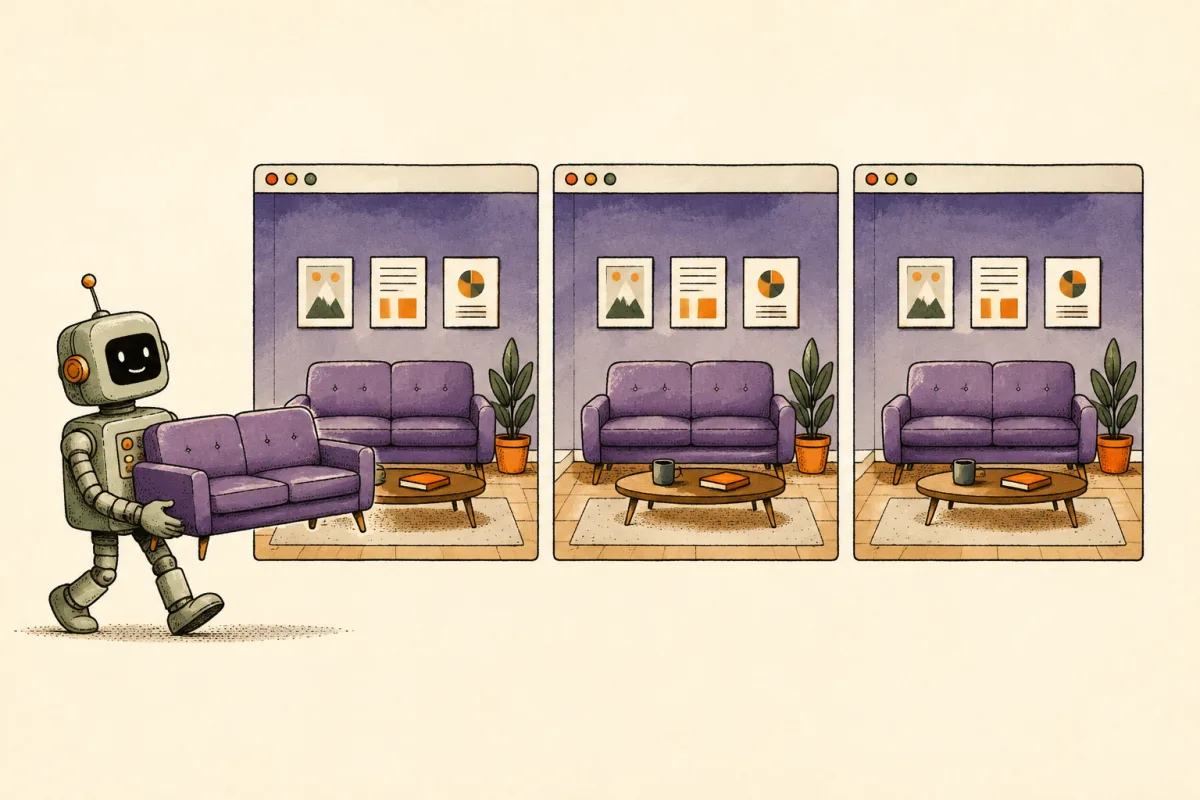
Somehow, every product has the same sofa
Then there’s the visual déjà vu: the enormous headline, the soft gradient, the three cards, the reassuring little badge. You know the apartment. You’ve seen this sofa before.
Purple even has an apology. Tailwind CSS co-creator Adam Wathan
joked that his choice of bg-indigo-500 for Tailwind UI buttons
had turned AI-generated interfaces indigo. One button colour, an unexpectedly long shadow.
The implied explanation is that examples become training material, and their design choices become the next generation’s defaults. It’s a memorable hypothesis, delivered as a joke. It doesn’t establish why any particular model produces purple gradients.
The 2025 Web Almanac’s analysis of AI colours adds some measurements to the story. Selected purple indicators didn’t surge within the Tailwind-site sample, though their presence grew across the wider web alongside Tailwind. Gradients showed no statistically significant increase either. The colour analysis tracked CSS variables, so it couldn’t capture every implementation.
The purple sofa is a recognisable joke, not an AI detector. Repeated examples and vague design briefs deserve scrutiny; a universal machine preference for purple remains a much bigger claim.
A default can save you from a blank page. It can also make it easy to stop asking what should be different about this page: the audience, the content, the rhythm, the personality.
At some point, somebody has to pick the sofa.
I miss the arguments a little
Angular versus React. Node.js versus Java. Yes, Node.js is a runtime and Java is a language. Thank you. You have successfully recreated the opening comment.
Those debates haven’t disappeared. But in the prompt-to-preview workflow, they can feel strangely far away. The choice arrives already made, wrapped in a successful build.
I don’t miss the contempt, or the belief that someone’s framework preference was a diagnosis. I miss the part where people cared enough to explain what they wanted from their tools.
The useful arguments were about structure versus flexibility, a shared language across the stack, the libraries a team trusted, or the systems it already knew how to operate. Underneath the tribal shouting, there were real constraints trying to get a word in.
Even changing your mind meant something. You had to understand the other person’s argument well enough to let it annoy you productively.
A generated starter doesn’t ask you to defend a position. That can be a relief. It can also let an important decision slip past without becoming a conversation at all.

Keep the shortcut. Make the choice.
I’m happy to use Next.js and Tailwind when they fit. I’d just like the fit to be part of the brief.
Before asking an assistant to build a website, give it the boring details: who will maintain it, where it will run, how the content changes, and which parts actually need to be interactive. If there’s an existing stack, say so.
For a small site, that might sound like this:
Build a personal site with a blog.
The articles are HTML files. Hosting serves static files.
Keep browser JavaScript limited to the interactions that need it.
Before adding a framework, explain which requirement it solves.
That’s close to the setup behind this blog: HTML articles, ordinary CSS, and a small Python build step. It suits the job. A different product could justify a very different answer, including Next.js.
You can also ask the assistant to compare its first choice with a simpler alternative. Not a twenty-page framework beauty contest. A few honest sentences about what you gain, what you take on, and who has to maintain it.

I don’t need the framework wars back in full. The internet has enough people being confidently unpleasant about brackets.
But I’d like to keep a little of that old curiosity. A willingness to ask why this tool, for this project, with these people.
Let the assistant save us the typing. We can still have an opinion before it
runs npm install.